Pulse: Updated Current States and Machine Timelines Summary
· One min read
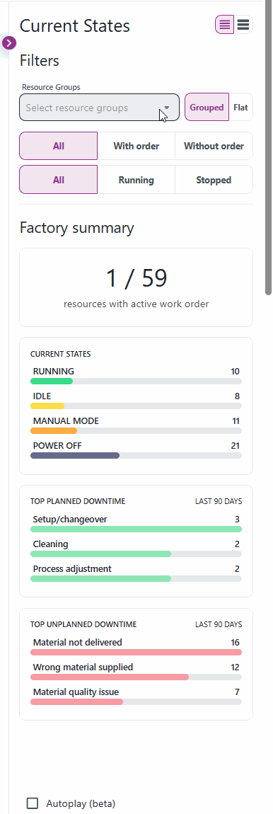
We have released an update to the Pulse app's Current States and Machine Timelines page summary, making it more insightful and relevant to your daily operations!
Key Improvements
-
Top Downtime Reasons Visualization
- The chart now uses new colors to clearly distinguish between planned and unplanned downtime reasons.
- Instead of showing all downtime reasons ever reported, the chart now focuses on the last 90 days, giving you a more current view of your factory's performance.
-
Factory Summary Now Follows Filters
- The summary values for resources with active work orders, current machine states, and top downtime reasons now dynamically update based on the filters you set on the page.
- Previously, these values were static and did not reflect your selected filters.
These changes make it easier to focus on the most relevant data and quickly identify trends or issues in your production environment.
Demo: