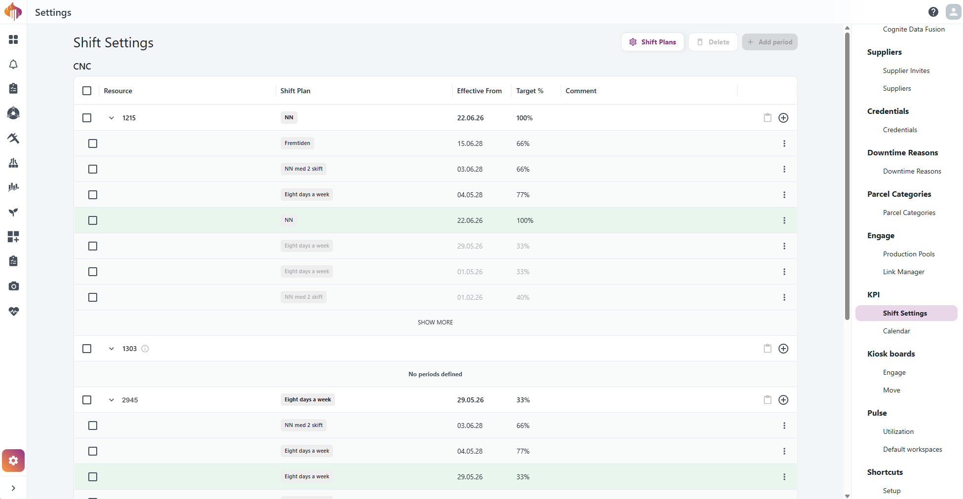
Shift Settings replaces Capacity
· 2 min read
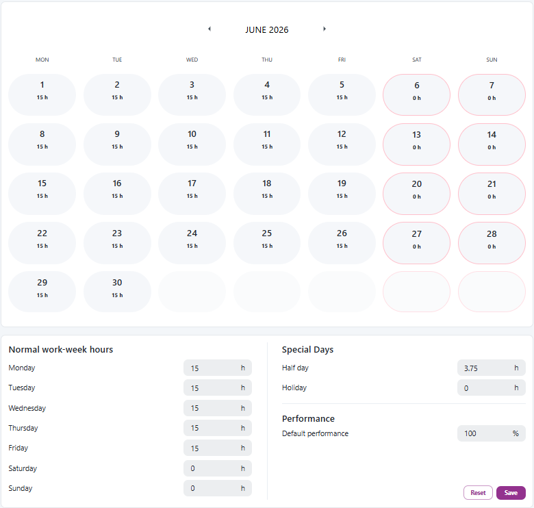
The Capacity admin settings has been replaced by Shift Settings — a more powerful way to define how your resources work and what utilization you expect from them.
Your existing capacity data has been migrated automatically. Nothing is lost, and KPI and OEE calculations continue as before.