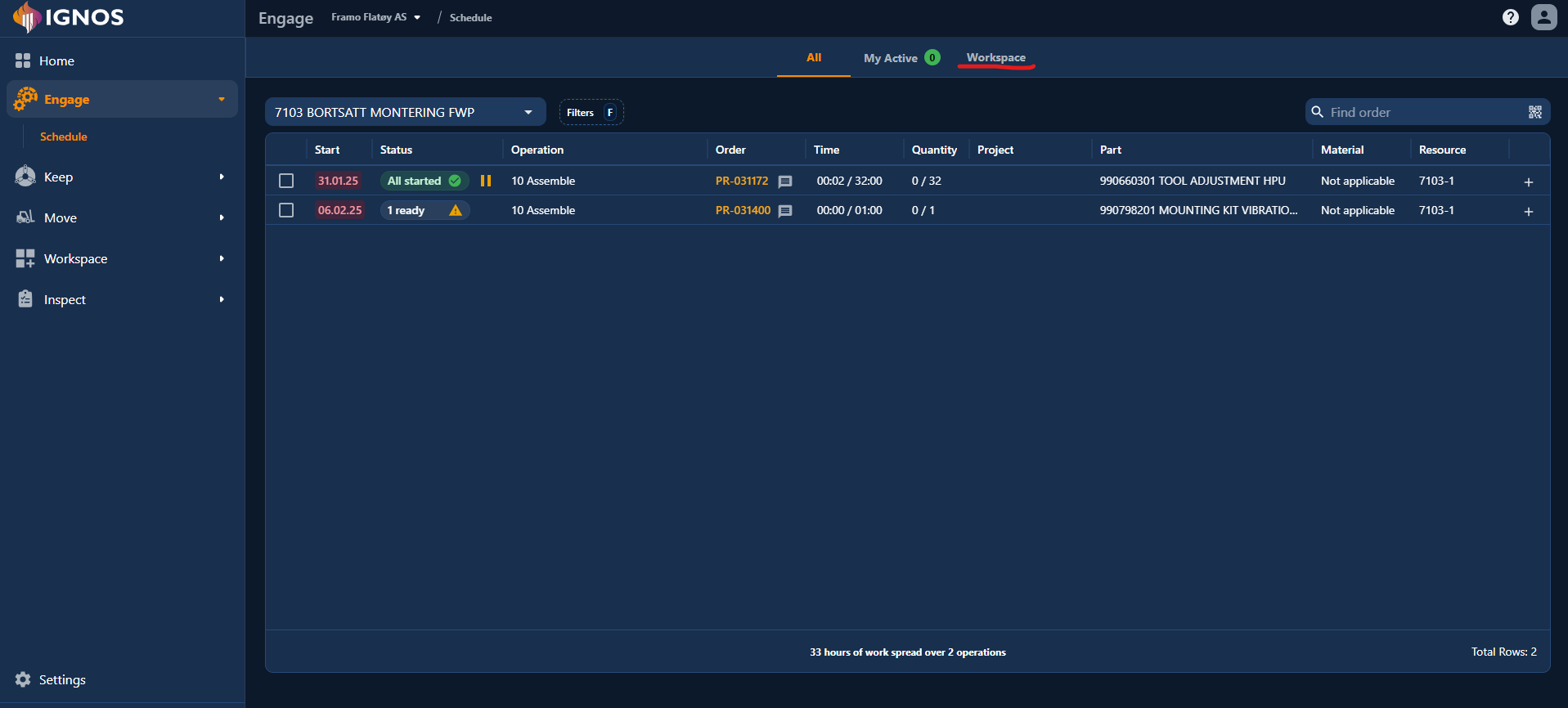
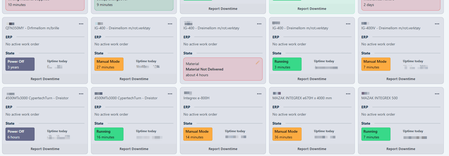
We’ve expanded Pulse with two new utilization methods:
- Machine Capacity utilization (OEE)
- Calendar Capacity utilization (OOE)
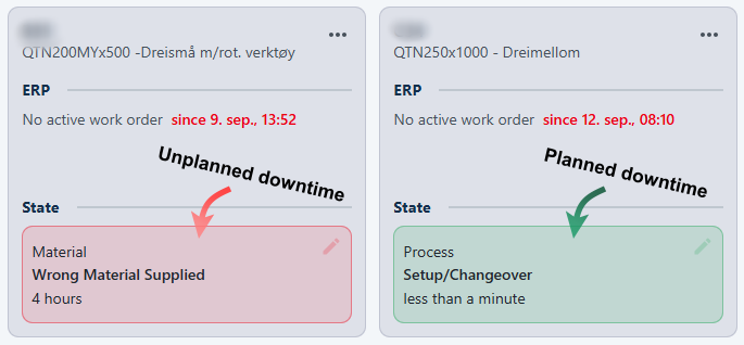
Examples
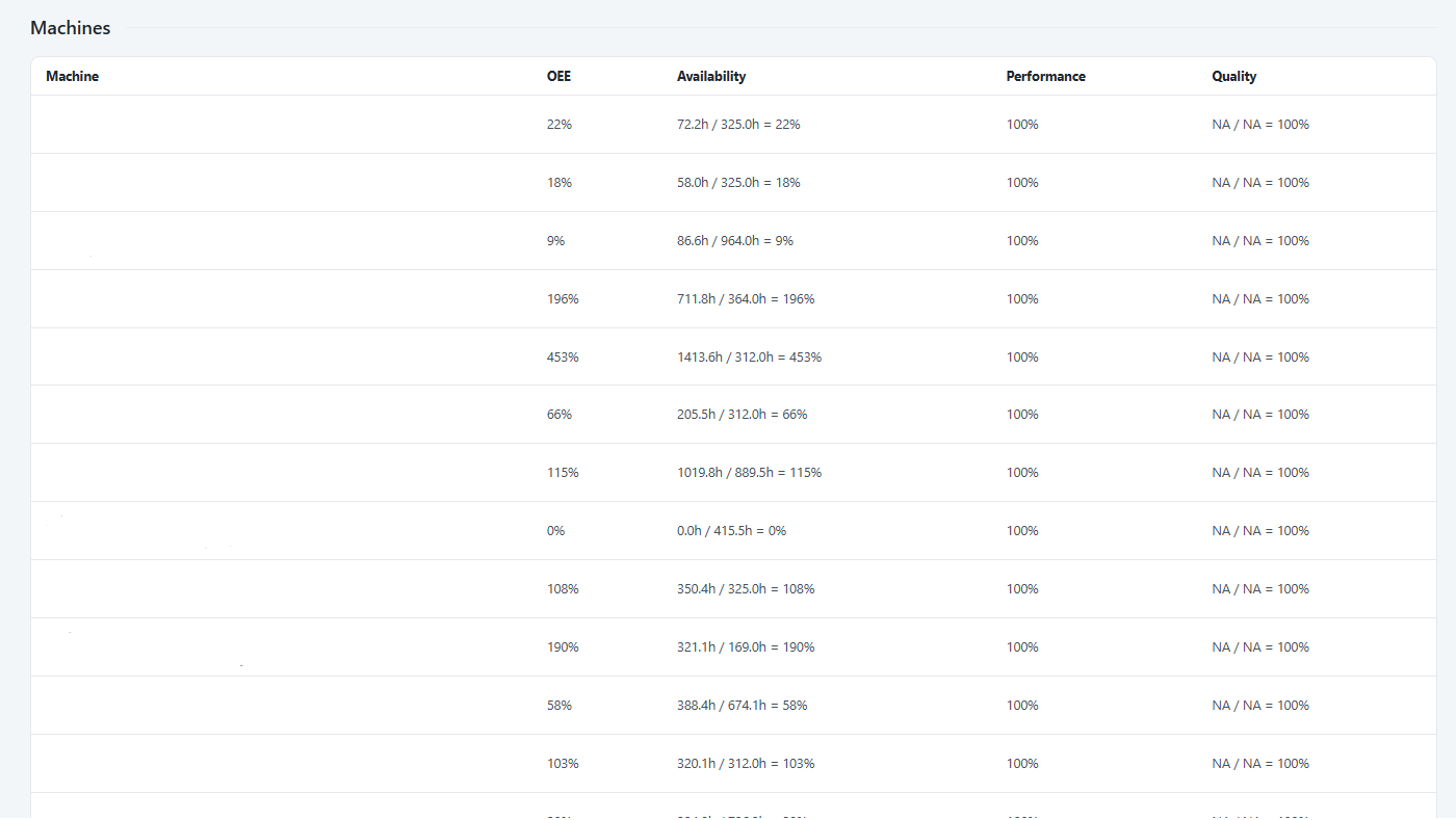
Machine Capacity utilization (OEE)
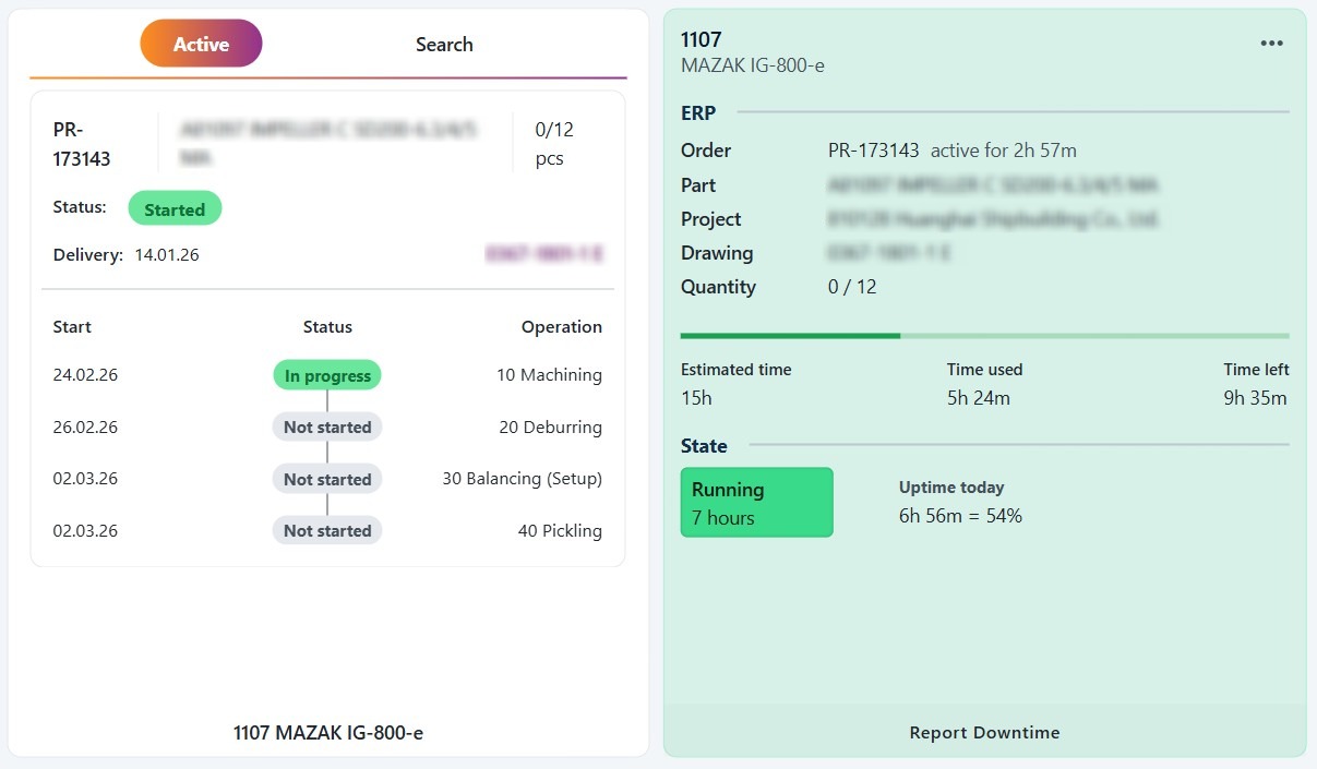
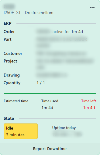
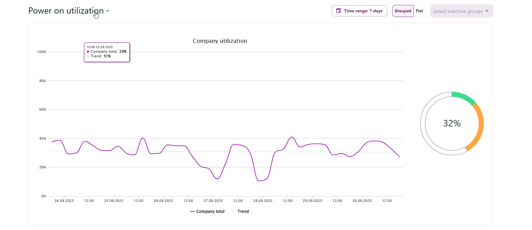
Machine Capacity utilization calculates how effectively a machine is used compared to its planned daily capacity.
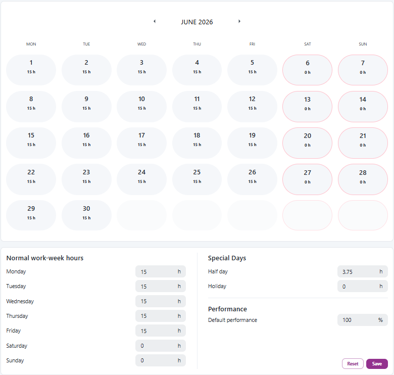
Admins can dynamically configure the daily capacity for each machine.
For example:
If a machine has its Monday capacity set to 8 hours, and its uptime is 4 hours, the utilization will be 50%.
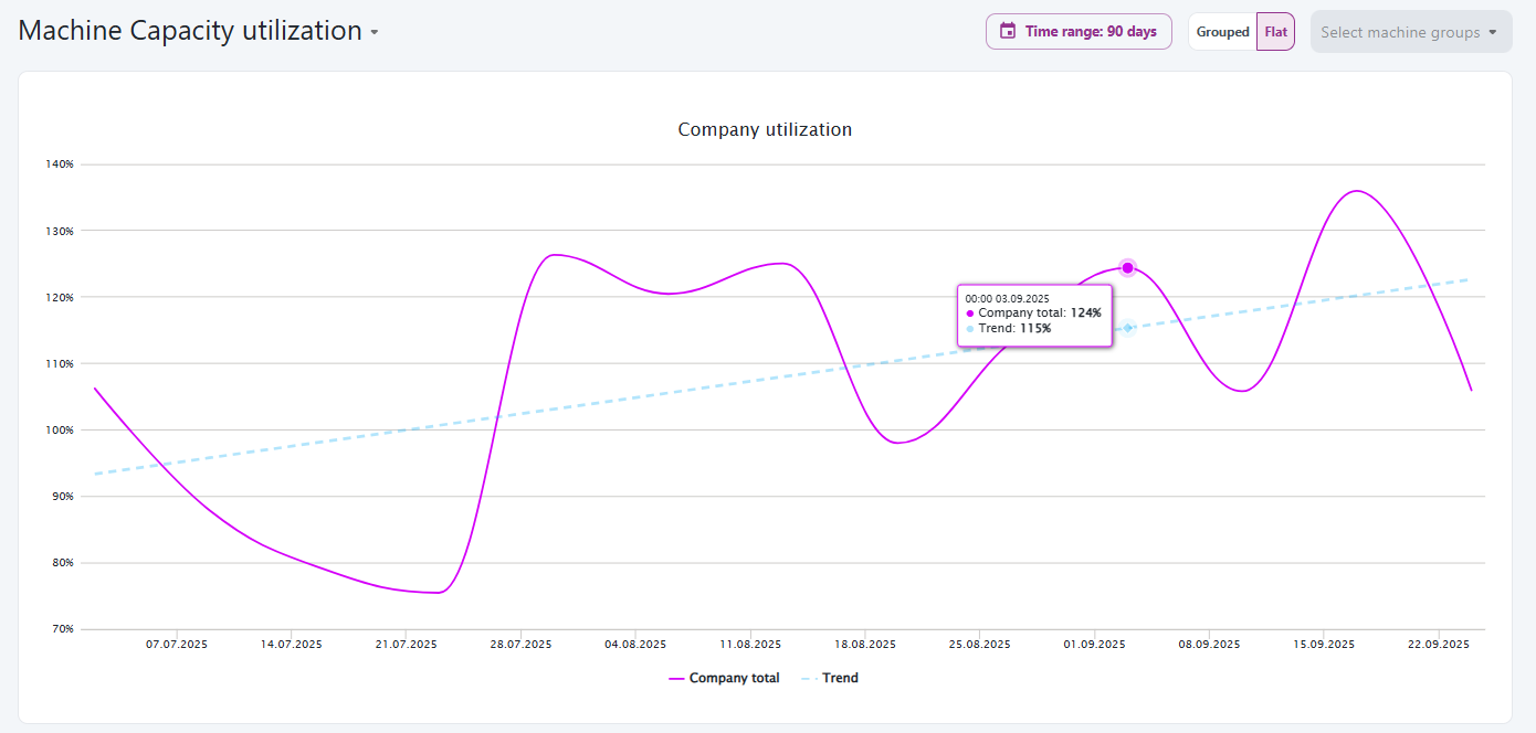
In systems where Performance and Quality values are available, the OEE calculation will include them. When these values are not provided, they are automatically set to 100%, meaning OEE effectively reflects Availability.
💡 Admin Tip:
Be careful when assigning very low capacity values (for example, 0.1 h) to weekends or non-production days. If the machine runs even briefly on those days, utilization can spike to unrealistic levels (thousands of %). Set capacity to 0 h for days with no planned production to avoid distorted results.
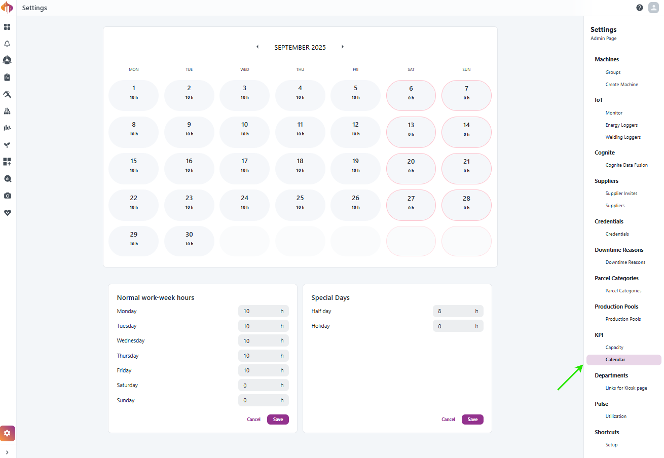
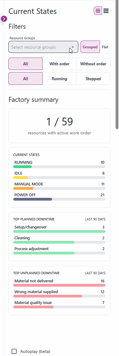
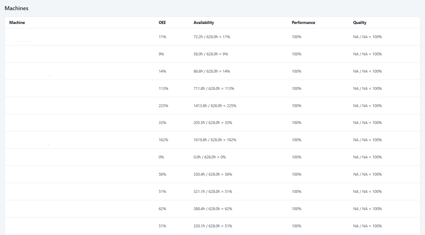
Calendar Capacity utilization (OOE)
Calendar Capacity utilization calculates how effectively a machine is used compared to the company’s planned calendar capacity.
Admins can dynamically configure the calendar capacity.
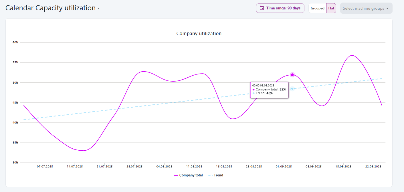
Just like with OEE, in systems where Performance and Quality values are available, the OOE calculation will include them. When these values are not provided, they are automatically set to 100%, meaning OEE effectively reflects Availability.
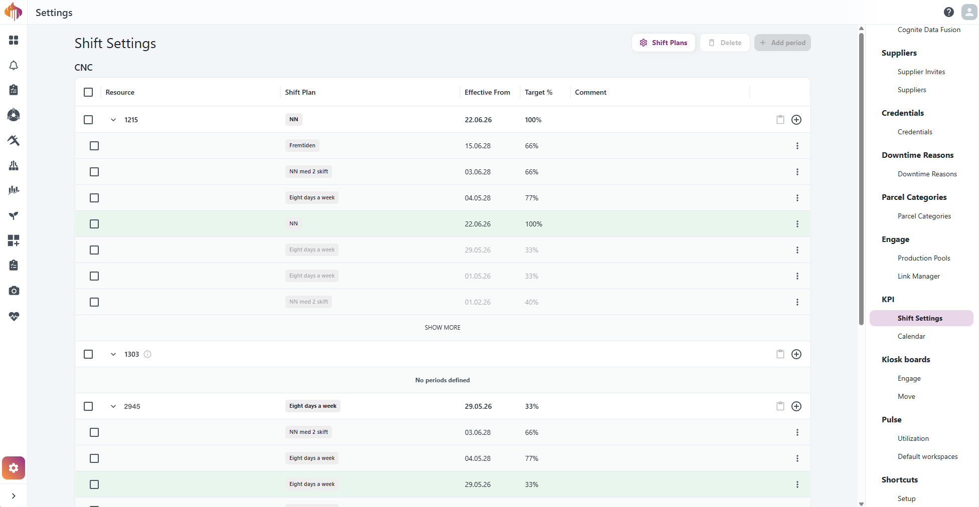
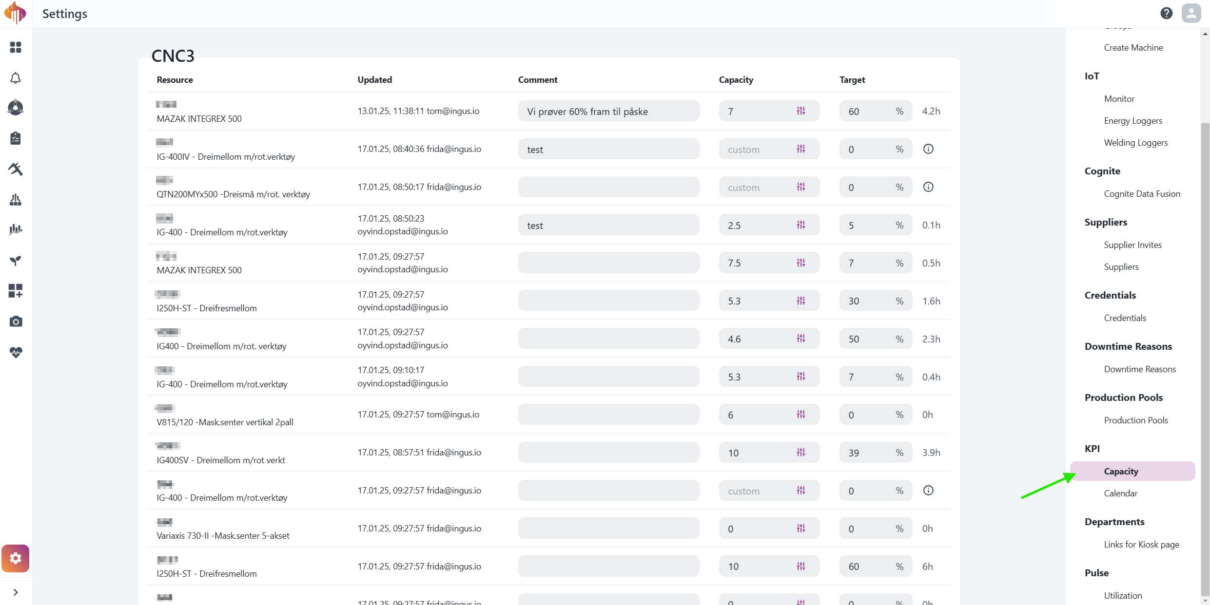
Machine Capacity settings for Admins
Factory Calendar settings for Admins