Fixed Y-Axis for Utilization Graphs
· One min read
We’ve improved the readability of utilization graphs by introducing a soft maximum of 100% on the Y-axis.
What’s new
- When utilization values are below 100%, the Y-axis is locked at 100% for easier comparison across different insights.
- When utilization values exceed 100%, the Y-axis dynamically adjusts beyond 100% to fit the data.
- This ensures more consistent scaling when comparing Power-on, 24/7, Factory Calendar, and Machine Calendar utilization insights.
Example
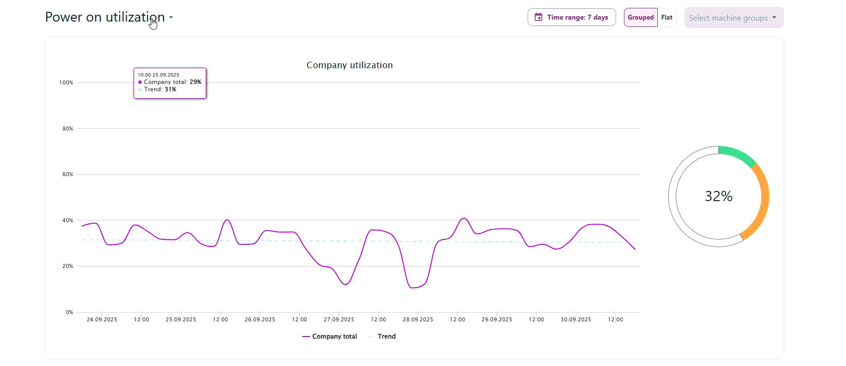
The Y-axis stays consistently locked at 100% until utilization values go beyond 100%, at which point the axis automatically adjusts.